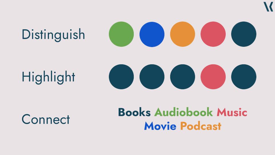
Tag: Data Visualisation
-
50 Shades of Grey
How to dominate your use of colour! I created a presentation about the use of colour in data visualisation for the virtual Analytics Tableau User Group. Below you’ll find all slides, including links to further resources and a recording of the talk, once it is available. The slides on their own are probably not super…
-
Data Visualisation is not (only) about creating charts!
The other day I realised something! It wasn’t a very innovative thought but it helped me to better contextualise what I (and most others who will read this) do. When talking about data visualisation, the first thought which comes to many peoples minds is “creating charts”; that’s – understandably – what many people associate with…
-

Triangles in Data Visualisation
I recently gave a guest lecture at the University of Auckland for the Data Visualisation Students. Andrew Eberhard, the lecturer, asked me to talk about myself and my background, my job and the industry, data visualisation in general and Tableau in particular. It was a bit strange to actually describe my job and how the…