-

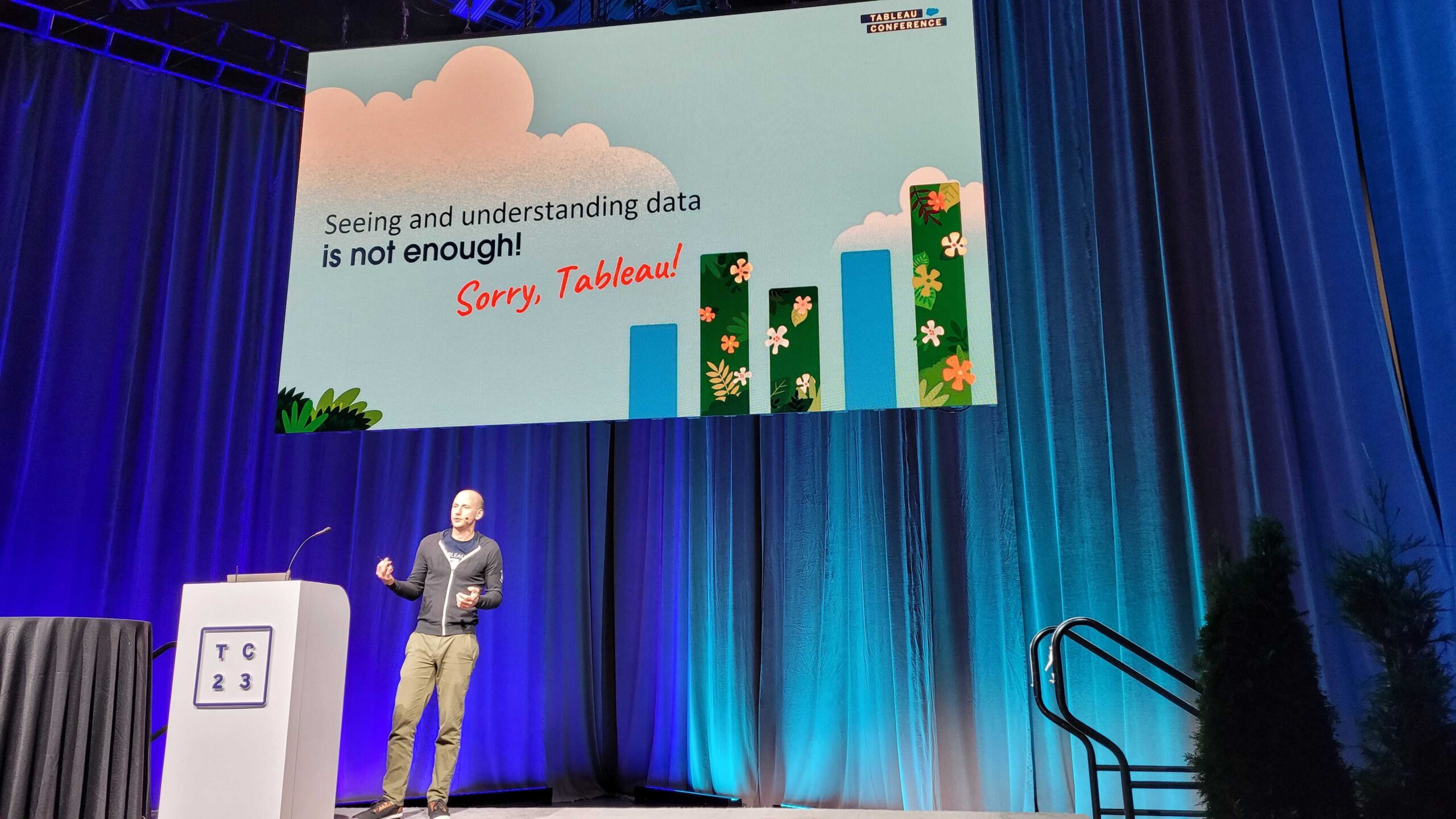
Becoming Data-Driven through UX – The Power of Empathy
This is a summary of my presentation at TC23 of the same title, while it was prepared for a Tableau event, it is entirely tool independent; in fact all aspects of it apply similarly to any other solutions you would want to design, websites, apps, products, etc. Below you’ll find a written summary of the Read more
-

Building Physical Maps…with LEGO
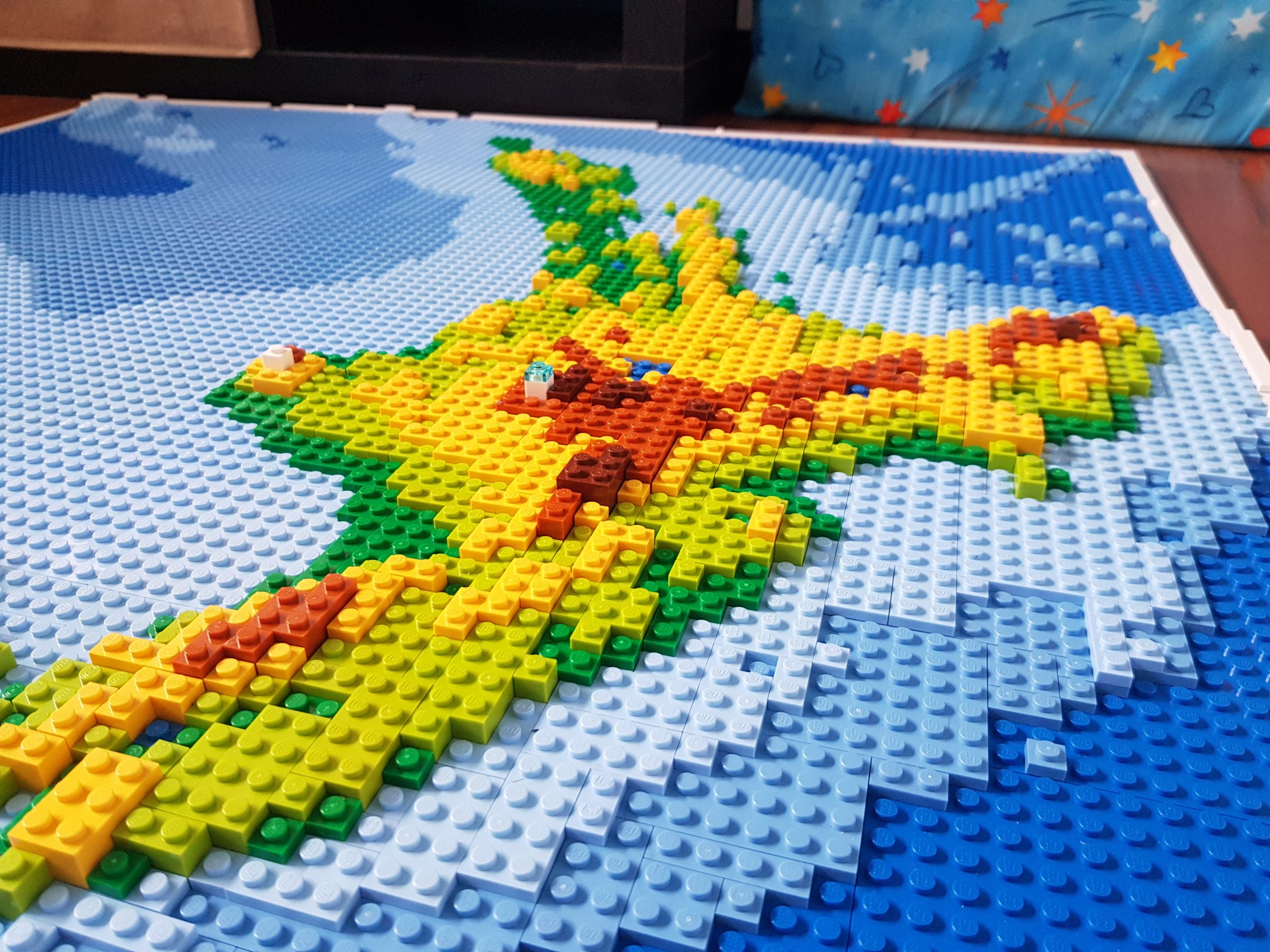
This post first appeared in the Data Visualization Society’s Medium publication “Nightingale” as part of their “Data Sensification” series. The content is the same with the exception of a little update at the end. In the beginning of 2020 I decided to attempt using LEGO bricks as a map-building material for a map of Aotearoa Read more
-

New Zealand LEGO Map
People sometimes have weird ideas. This was definitely one of them. I didn’t even set out to build a LEGO map of New Zealand…it just happened. In January this year I was working on something completely unrelated, based on a quick map I did a bit earlier. I had created a map in Tableau but Read more
-

Data Visualisation is not (only) about creating charts!
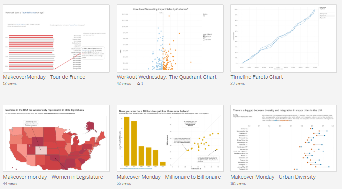
The other day I realised something! It wasn’t a very innovative thought but it helped me to better contextualise what I (and most others who will read this) do. When talking about data visualisation, the first thought which comes to many peoples minds is “creating charts”; that’s – understandably – what many people associate with Read more
-

Triangles in Data Visualisation
I recently gave a guest lecture at the University of Auckland for the Data Visualisation Students. Andrew Eberhard, the lecturer, asked me to talk about myself and my background, my job and the industry, data visualisation in general and Tableau in particular. It was a bit strange to actually describe my job and how the Read more
-

Project Maestro – Delivering on Alteryx promises
Ever since one of my contacts at Tableau mentioned Project Maestro, I was keen to get my hands on it to see how data transformation can – hopefully – seamlessly be integrated with data visualisation. Now, since the first beta versions have been released I wanted to write down my initial thoughts as somebody who Read more
-

Everybody’s a Hacker
This post is based on a presentation that I originally created for the Auckland Tableau User Group (#AKLTUG) in December 2016 and then extended for the Tableau Fringe Festival APAC (#TFFAPAC) in August 2017. It’s best consumed as what it is: a talk! So I encourage you to watch the recording of the #TFFAPAC talk Read more


